06/09/2020
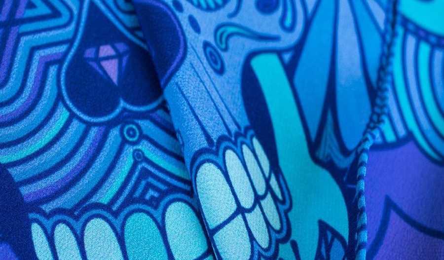
The silk pocket square flashes teal and fuchsia—folded, the design is obscured, and you’d never imagine that it depicts skulls that look like tattoos.... On a humble sock, simple shapes look funky and carefree, but they actually have a deeper meaning…. These garments were designed, respectively, by Patrick Morrison of Furious Goose and Kaylan K. of Lost in the Island. And they represent a tidal shift in the world of fashion.

Patrick Morrison designs vibrantly colored scarves and pocket squares that, unfolded, often reveal startling juxtapositions.
Thanks to digital design tools, textile design is experiencing something of a renaissance. The field attracts graphic designers and illustrators because it employs many techniques they are already familiar with, but it enables visual thinkers to expand beyond the page and the screen. Fabric offers new opportunities and challenges with designs that move, flutter, and twirl along with their wearers. In addition, some creatives see designing textiles as a way to make the switch from corporate design to crafting objects that are more personal. Clothes have the power to be more abstract and intimate than many client-based assignments.
TRANSITIONING TO TEXTILE DESIGN
Patrick Morrison started out in printmaking and graphic design, in the U.K., eventually working for brands such as Oxfam and American Express. Three years ago, he stumbled upon fabric that he knew must have been designed by vector—and he felt a longing to challenge himself creatively.
<
Furious Goose scarves add a dash of elegant color to an outfit—sometimes with a secret message.
FINDING A VISUAL LANGUAGE
Now based in Austin, Paige Russell studied graphic design at Savannah College of Art and Design. During her studies, she would make paper collages as a way to take breaks from staring at her computer. This practice evolved and she started combining paper and digital work to create patterns printed on scarves.
Paige says the cutouts spoke to her aesthetic preference for bold, graphic shapes and bright colors. Plus, people who might not be able to afford an art print can afford a scarf with the same design.
“I liked working with the computer and liked problem-solving with branding and web design, and then it just clicked: I was like, ‘Whoa, yes!’” Paige says. “I was obsessed with bright colors and color theory, drawing and painting. That was me finding my actual visual language. It felt really good and right; I loved the look of it. I felt like that was me.”
WEAVING IN MEANING
Kaylan appreciates the repetition of patterns, how they ask the viewer to journey through a visual pathway much like the work of artists she admires—Jean-Michel Basquiat and Salvador Dalí. She creates as many as 50 sketches first, and then she spends several hours refining her work.
“It’s a shame that people think digital art is easy,” she says. “Art is art, regardless of which medium you use. You just have to bring out new ideas and make people stare at it, make people think differently.”
She wants to be known for elevating digital design to the level of fine art.
“I want to show that it takes as much time to create something traditionally as it does to brainstorm something beautiful to come out through the computer,” she says. “It’s the same process. We just have to make people see it differently.”

“I want to show it takes as much time as creating something traditionally as it does brainstorming something beautiful to come out through the computer,” she says. “It’s the same process. We just have to make people see it differently.”
For his part, Patrick loves the creative potential of the pocket square. In traditional menswear, it’s one of the few areas that’s colorful and playful. He adores the deep saturated color that silk gives his designs, as well as the juxtaposition of crisp, digital vector art with a classic article of clothing worn since King Richard II.
He’s inspired by punk, irreverent fashion designer Vivienne Westwood and Emilio Pucci’s exuberant colors and patterns. Tongue-in-cheek designs and messages such as “Fury” and “Lust” are hidden in the folds of his pocket squares.
“You can be quite cheeky with it because it’s hidden away in your pocket,” he says. “There’s sartorial elegance with classic Italian and hipster styles—I’m trying to bridge that gap and make it younger. Mine look like they could only be produced in Illustrator, and that gives it a more modern edge.”
“There’s something nice about having your counter-culture in your pocket,” he adds “What I like is the juxtaposition of luxury and a little bit of shock value.”
About the Furious Goose process, Patrick says, “We always begin with pen and ink. That’s where the inspiration is. We scribble down our thoughts on paper. Then we fire up Illustrator and redraw our image in vector. We use symbols in Illustrator so we can rapidly change designs across the whole canvas. We also use named colors, to be able to change out each color…. Once we have our color ranges, we go to print. That’s where the magic happens—our colors look gorgeous on silk."
“I want to have a series of clothing where I tell stories through my art,” she says. “It’s like wearing a story on you that creates positivity and joy all around you. Art should be everywhere.”
